The use of color in interior design isn’t just about aesthetics; it’s a powerful tool that influences how people feel and interact within a space.
Colors can transform a room, making it feel larger or smaller, warmer or cooler, and even more energetic or calm. Whether used to create a focal point or to bring harmony to a space, color is one of the most accessible yet impactful elements in interior design. From the color of the walls to the furniture, accessories, and lighting, color plays an essential role in shaping the overall ambiance of a room.
- The basics of color theory
- Psychological and emotional impact of color
- Applying color theory in interior design
- Popular color schemes in interior design
- Conclusion
The basics of color theory
Primary, Secondary, and Tertiary Colors
At the core of color theory are the primary colors—red, blue, and yellow—which can be mixed to create secondary colors—green, orange, and purple. Tertiary colors, such as teal or magenta, are created by mixing a primary color with a secondary one. Understanding these relationships is key to creating balanced and harmonious designs.
The Color Wheel
The color wheel is a visual tool that shows how colors relate to one another. It is divided into warm colors (reds, oranges, yellows) and cool colors (blues, greens, purples). Designers use the color wheel to create color schemes that are visually appealing and balanced. Complementary colors (opposite each other on the wheel), analogous colors (next to each other), and triadic colors (evenly spaced on the wheel) are all combinations used to create various effects in design.
Color Harmony
Color harmony refers to the way colors are combined to create a pleasing visual effect. Harmonious color schemes are essential in interior design as they bring balance to a space. For example, complementary color schemes use colors that are opposite each other on the color wheel, creating contrast, while analogous color schemes, which use colors next to each other, create a more subtle, unified look.
Psychological and emotional impact of color
Colors can have a profound psychological effect, influencing our moods, energy levels, and even behavior. For example, warm colors like red and orange can evoke feelings of excitement or warmth, while cooler colors like blue and green are known for their calming and relaxing qualities. Interior designers use this knowledge to tailor spaces to their desired emotional impact. For instance, a bedroom may be designed using soft blues and greens to create a restful environment, while a kitchen might use energizing yellows or reds to encourage activity.
The psychological impact of color also varies based on culture and context. In Western cultures, white is often associated with purity and simplicity, while in some Eastern cultures, it may symbolize mourning. Similarly, red may evoke passion or danger, depending on the context. Designers must consider these cultural connotations when selecting colors for a space, especially in multicultural or international settings.

Colors also affect how we perceive the size, shape, and temperature of a space. For example, light colors like whites, pastels, and neutrals make a room feel larger and more open, while dark colors like deep blues or charcoal can create a more intimate or cozy atmosphere. Bright colors can energize a space, while muted tones can add sophistication and calm.
Applying color theory in interior design
Choosing Colors for Different Spaces
Each room in a home or office has a unique function and atmosphere, and color can enhance these qualities. In living rooms, where people often gather, warm, inviting colors like beige, soft oranges, or earth tones work well. Kitchens, known for their activity, can benefit from bold, energetic colors like yellow or red to stimulate conversation and appetite. Bedrooms, on the other hand, are often painted in serene, cool tones to encourage relaxation and sleep.
Creating Focal Points with Color
Color is often used to create a focal point in a room, drawing attention to a specific area or object. Accent walls painted in a contrasting color or vibrant decor items like throw pillows, rugs, or art pieces can serve as a statement. Designers often use the 60-30-10 rule, where 60% of a space is dominated by one color, 30% by a secondary color, and 10% by an accent color, to create a visually balanced focal point.
Color in Small vs. Large Spaces
In smaller spaces, designers often choose light, neutral colors to make the area feel larger and more open. Soft shades of white, light gray, or pastels can expand the visual space. For larger rooms, designers may feel freer to experiment with darker, more intense hues to add depth and create cozy, inviting environments.
Using Color to Define Function
Color is also used to define the function of different areas within a larger open-plan space. For example, in an open-concept living space, designers might use different color schemes or accent walls to visually separate the living area from the dining or kitchen space, even if they are not physically separated. This helps create a sense of flow and organization while maintaining a cohesive look.
Popular color schemes in interior design
Monochromatic Schemes
A monochromatic color scheme uses variations of one color. By combining different shades, tints, and tones of a single hue, designers create a harmonious and sophisticated look. This approach works well in modern, minimalist spaces and offers a clean, uncluttered aesthetic.
Complementary Color Schemes
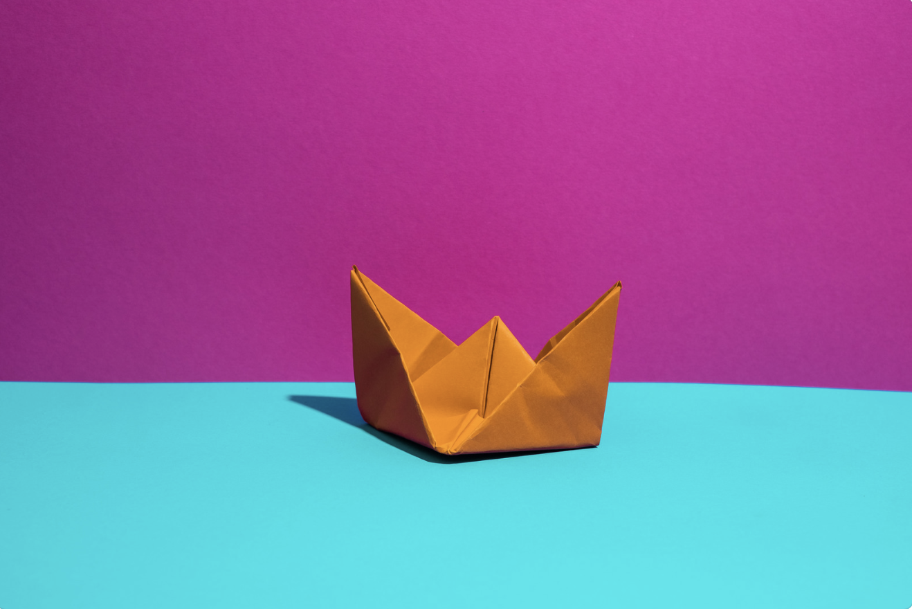
Complementary color schemes use colors that are opposite each other on the color wheel, such as blue and orange or red and green. This creates strong contrast and can make a room feel dynamic and energetic. However, designers must use these colors carefully to avoid overwhelming the space with too much intensity.
Analogous Color Schemes
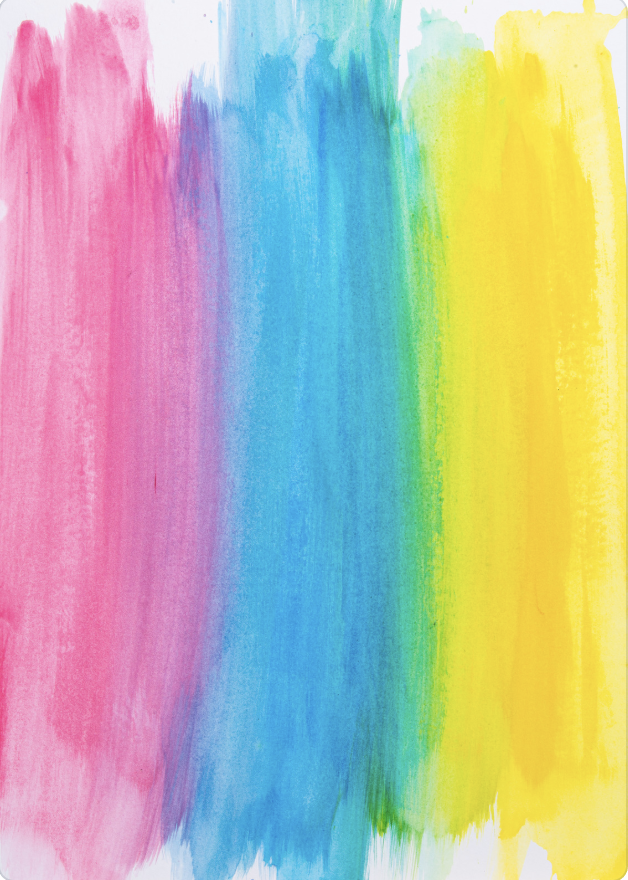
Analogous color schemes use colors that are next to each other on the color wheel, such as yellow, yellow-green, and green. This creates a sense of cohesion and tranquility. Analogous color schemes are often used in spaces where harmony and relaxation are the primary goals, such as in bedrooms or spa-like bathrooms.

Neutral Color Schemes
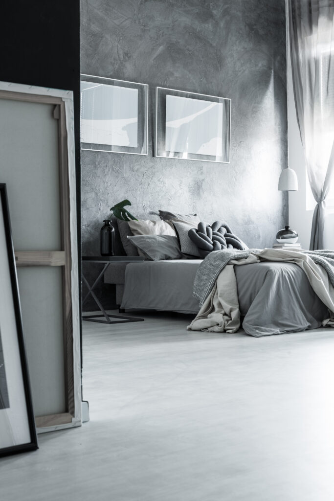
Neutral colors, including whites, blacks, grays, and browns, are often used as a foundation in interior design. These colors provide versatility, allowing other colors to shine through as accents. Neutral palettes create timeless, elegant designs that can be adapted over time with different color accents and furnishings.
Conclusion
Color theory plays a critical role in interior design, affecting not only the aesthetics of a space but also its mood and functionality. Understanding the psychological and emotional effects of color, as well as how to apply color theory in different spaces, allows designers to create environments that are both beautiful and purposeful. From color harmony to the psychological impact of hues, color is a powerful tool that shapes how we experience our surroundings.
As we navigate our daily lives in various environments, color subtly influences our emotions, perceptions, and behaviors. Designers who harness the power of color theory are able to craft spaces that enhance comfort, creativity, and functionality, making color one of the most accessible yet impactful elements in interior design.
As interior design trends continue to evolve, color will remain a vital aspect of creating meaningful and engaging spaces. With increasing awareness of how color affects our well-being, designers will continue to use color thoughtfully to promote sustainability, mindfulness, and emotional balance in homes and public spaces.


